Raajeev Bardhaan

Case Study: NSDL - National Digital Identity Enrollment Platform
Role: Senior UX Designer
Platform - Desktop application
Users:
-
Citizens
-
Registration Officers
-
Supervisors
-
System Administrators
1. Project Overview
When NSDL was implementing a national-scale digital identity enrollment and management platform using the MOSIP framework. The system is used at physical enrollment centers to onboard citizens, capture demographic and biometric data, update existing identities, and securely upload registration data.
The UX challenge was to design a system that is:
-
Easy to use for operators with varying digital literacy.
-
Accurate and compliant with identity rules.
-
Reliable in low-internet or offline environments.
-
Scalable across thousands of enrollment centers
I was responsible for designing the complete UX across all modules, from citizen pre-registration to operator workflows and data upload.
2. Problem Statement
Enrollment and identity update processes are complex, rule-driven, and error-sensitive. Operators need to perform multiple steps accurately while managing hardware devices, citizens, and system constraints.
Key Challenges :
-
High risk of data entry and biometric errors.
-
Offline-first system behavior
-
Strict compliance and audit requirements
-
Different user roles with different responsibilities
The goal was to simplify these complex workflows without compromising accuracy or security.
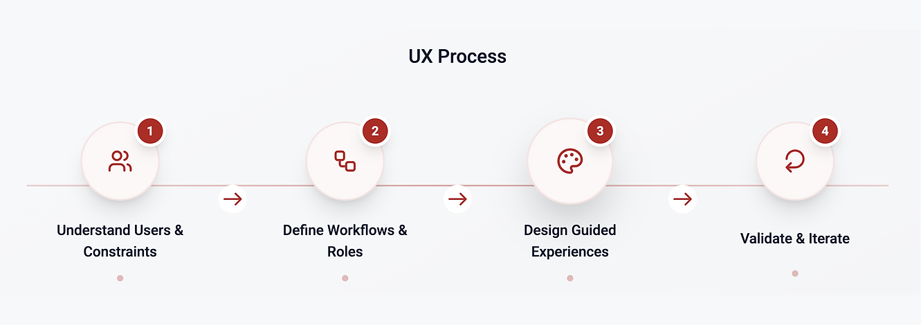
3. Design Approach
I followed a standard UX design process, adapted for a government and system-heavy product:
-
Understanding users and constraints
-
Defining clear workflows and roles
-
Designing step-by-step, guided experiences
-
Creating consistent and functional UI patterns
-
Iterating based on usability and edge cases
4. Research & Understanding
What I did
-
Reviewed existing enrollment and update processes
-
Worked closely with stakeholders to understand rules and dependencies
-
Identified key user roles and their daily workflows
-
Studied MOSIP guidelines to ensure UX alignment
Key Insights
-
Operators prefer guided, linear flows over flexible forms
-
Clear system feedback reduces anxiety and mistakes
-
Preview and confirmation steps are critical in identity systems
-
Visual clarity is more important than aesthetic richness
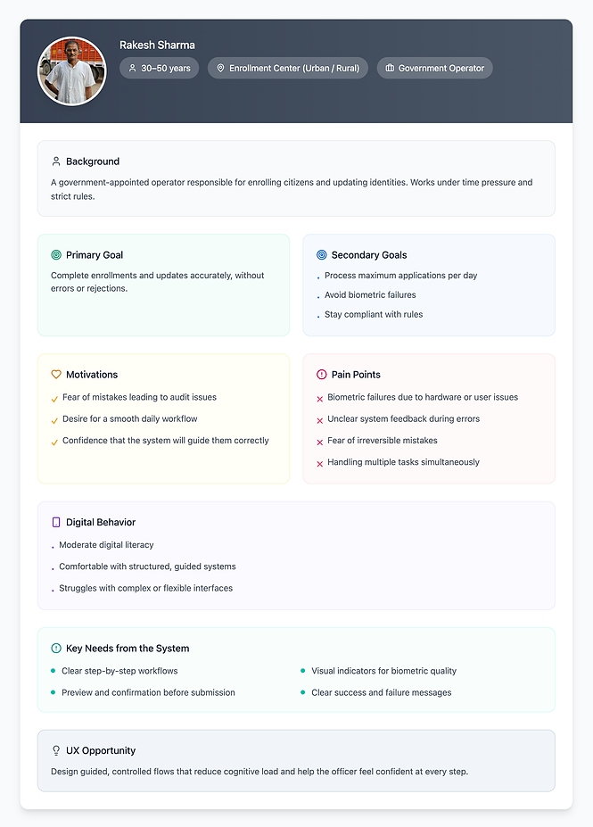
Users and Roles
Persona 1 - Citizen (Pre Registration User)
Persona 2 - Registration Officer (Primary System User)

Persona 3 - Supervisor (Center-level Oversight)
Persona 4 - System Admin (Technical & Operational)

.png)
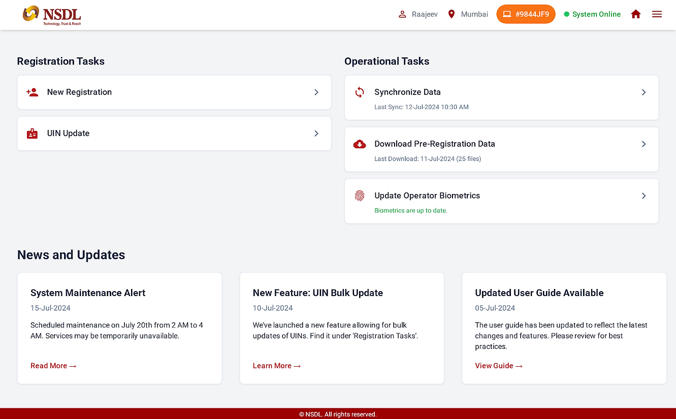
6. Information Architecture
I designed the system with clear role-based access, ensuring users only see actions relevant to them.
Core Modules
-
Pre-Registration
-
Operator Onboarding
-
New Registration
-
UIN Update
-
Upload Registration Data
This reduced cognitive load and prevented unauthorized or accidental actions.


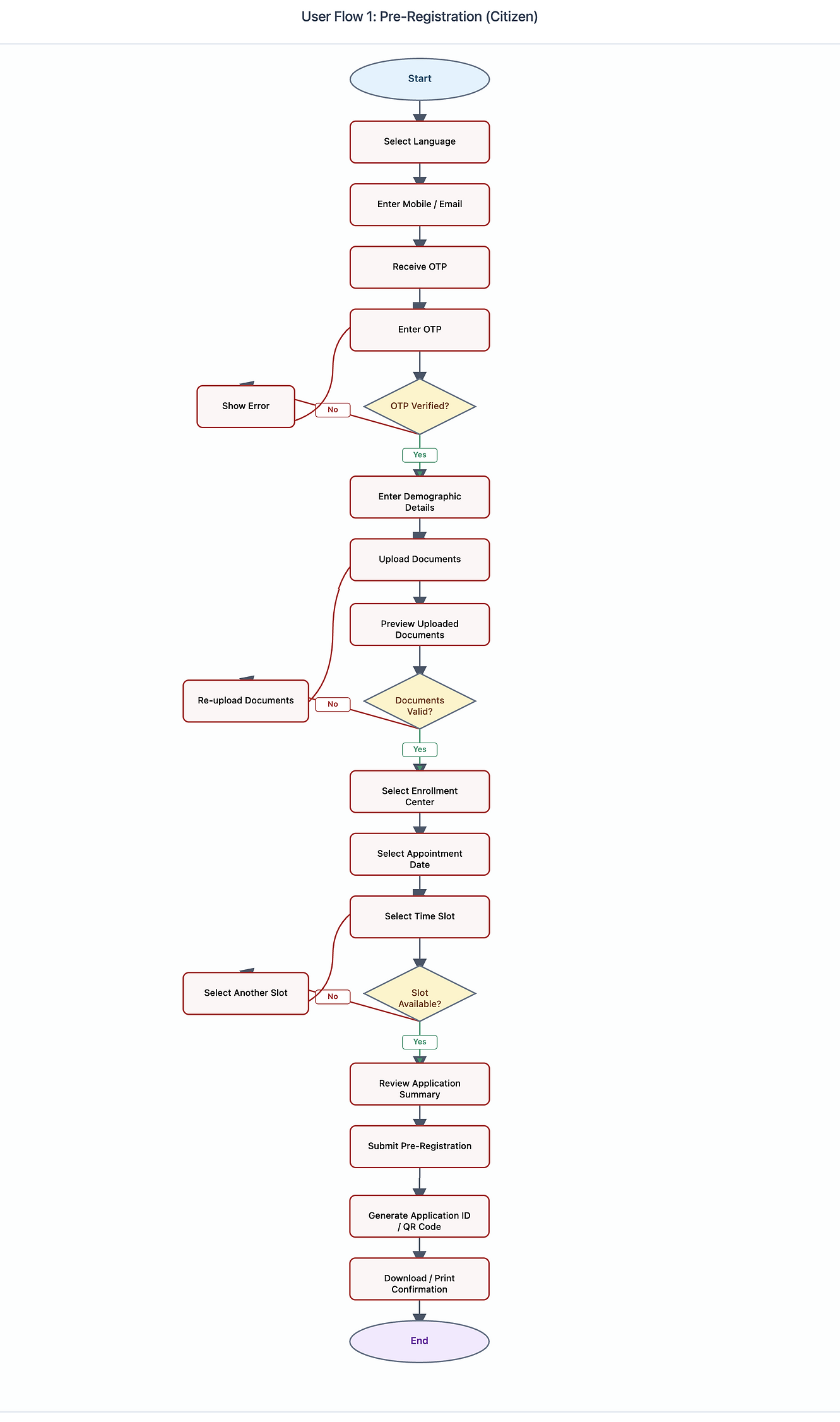
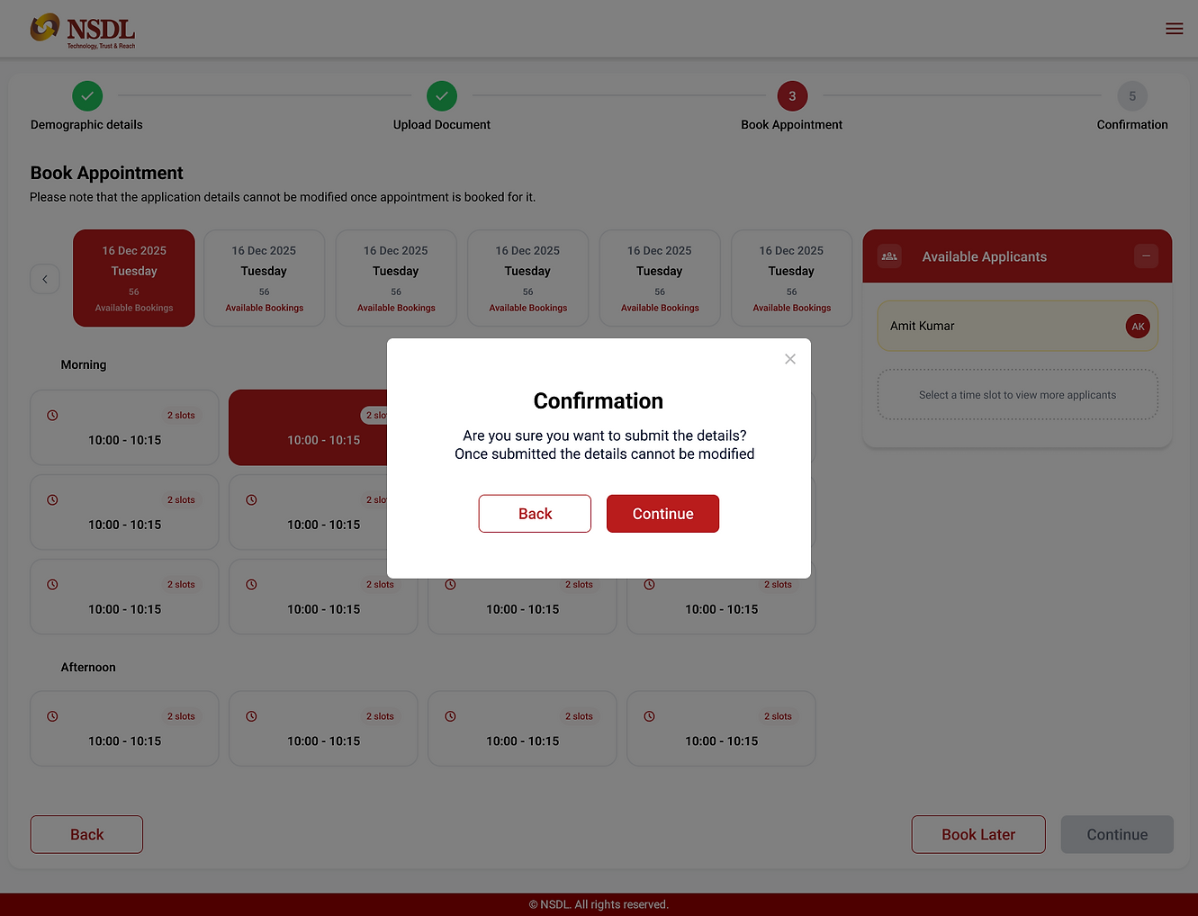
Module 1: Pre-Registration (Citizen)
What this module is about
This module allows citizens to pre-register online before visiting the enrollment center. It helps reduce queue time and operator workload.
Key Features
-
Language selection
-
OTP-based verification
-
Demographic data entry
-
Document upload
-
Enrollment center selection
-
Appointment Booking
-
Confirmation and receipt
What I did as a UX Designer
-
Designed a linear step-by-step flow to reduce confusion
-
Used progress indicators to show completion status
-
Ensured clear messaging where data becomes non-editable
-
Designed a confirmation screen suitable for print and SMS/email
Pre - Registration User Flow
Pre Registration UI Screens


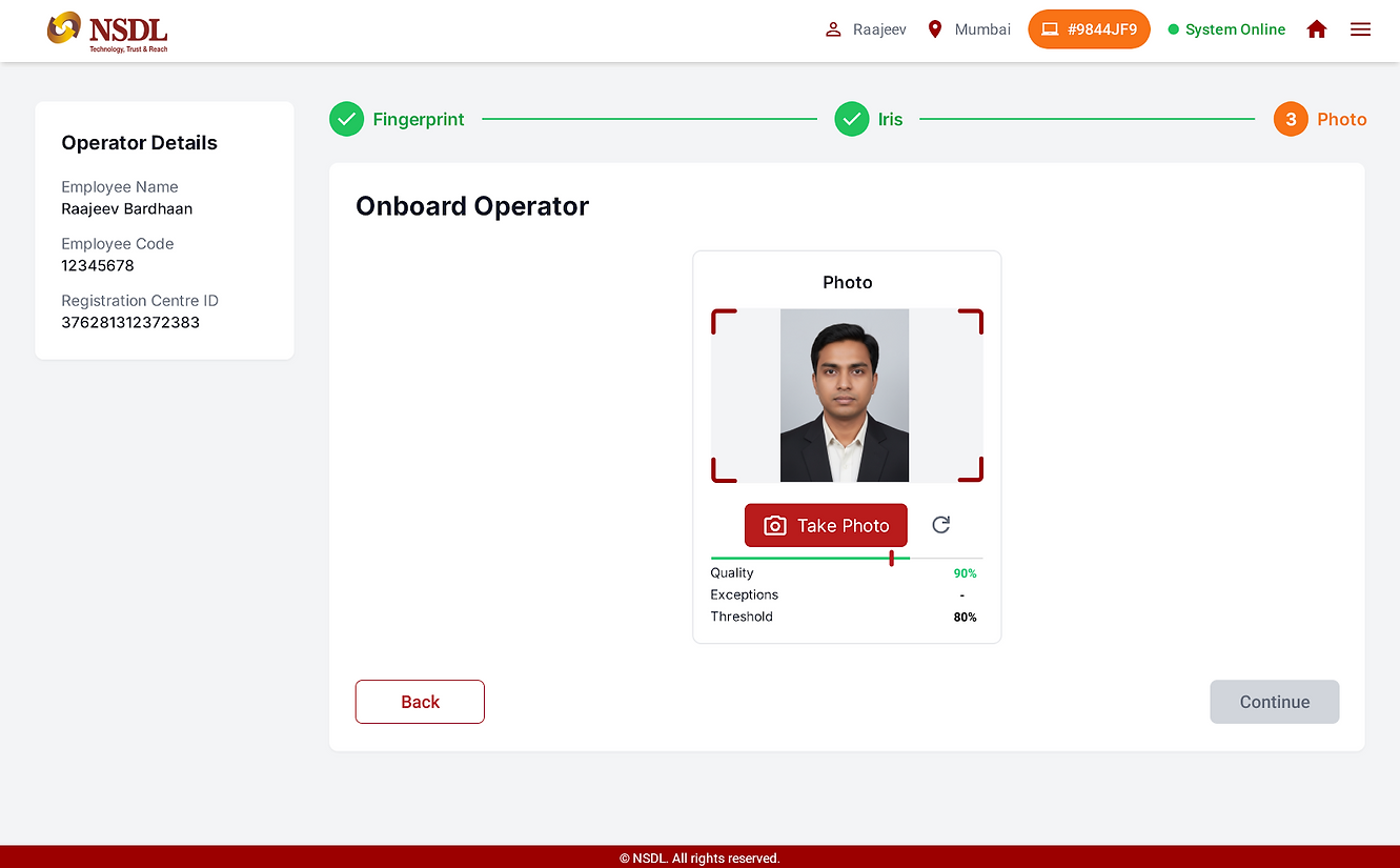
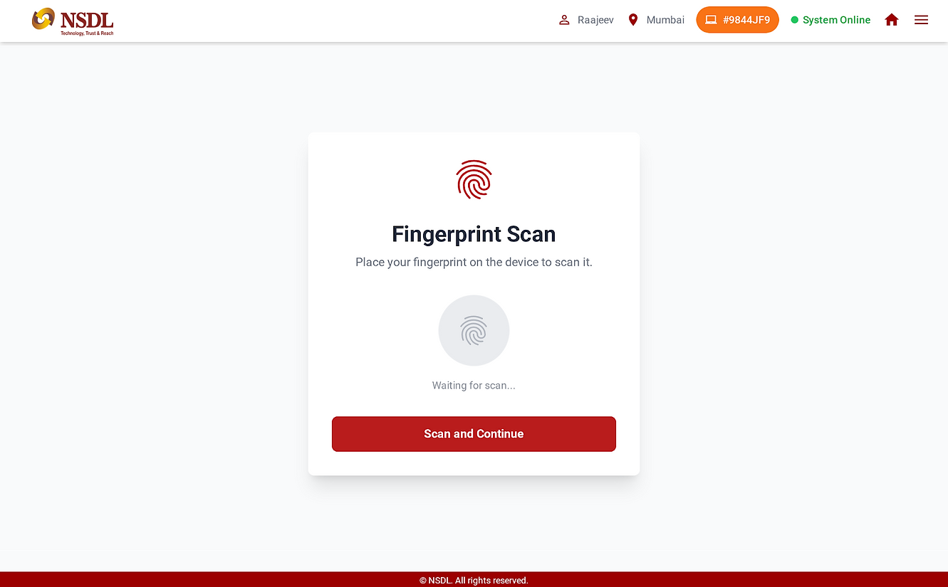
Module 2: Operator Onboarding
What this module is about
Before an operator can perform enrollments, they must be onboarded and authenticated into the system.
Key Features
-
Operator login
-
Biometric capture (fingerprint, iris, photo)
-
Device and operator binding
-
Onboarding confirmation
What I did as a UX Designer
-
Designed a guided biometric capture flow, one step at a time
-
Displayed quality and threshold indicators for transparency
-
Provided clear success and failure feedback
-
Ensured the onboarding process builds operator confidence
Operator Onboarding Userflow

Operator Onboarding UI Screens


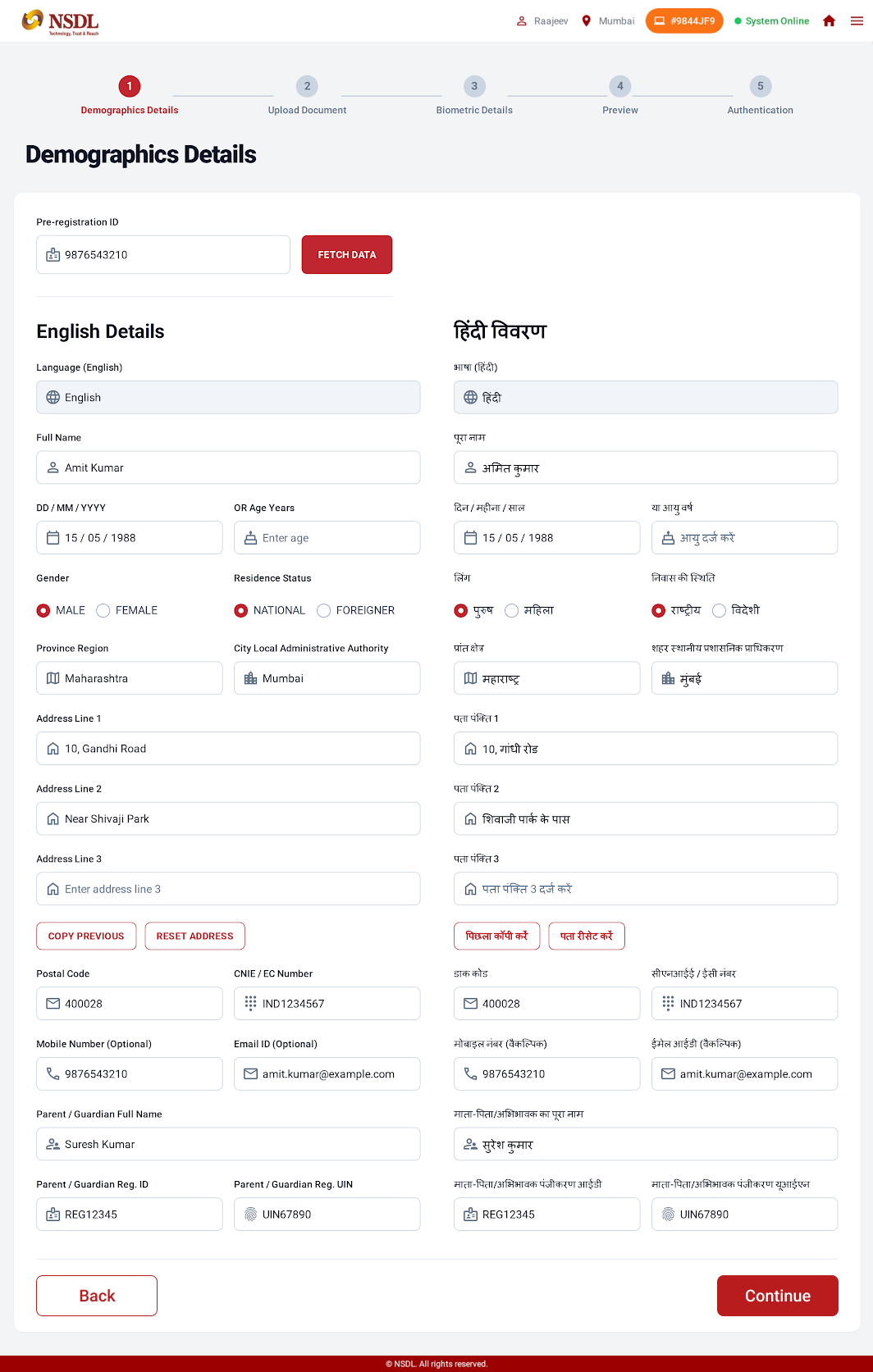
Module 3: New Registration
What this module is about
This is the core enrollment flow, where a new identity is created.
Key Features
-
Fetch pre-registration data
-
Demographic data entry (dual-language support)
-
Document scanning and preview
-
Biometric capture (fingerprint, iris, photo)
-
Biometric capture (fingerprint, iris, photo)
-
Preview and authentication
What I did as a UX Designer
-
Structured the flow using a stepper to show progress
-
Designed clear document upload and preview interactions
-
Integrated real-time biometric quality feedback
-
Added preview screens to allow verification before submission
New Registration user flow

New Registration UI Screens


Module 4: UIN Update
What this module is about
This module allows updates to an existing identity, such as name, address, biometrics, or contact details.
Key Features
-
UIN input and validation
-
Field selection for updates
-
Adult/minor logic handling
-
Conditional biometric capture
-
Update confirmation
What I did as a UX Designer
-
Designed a field-selection approach to control update scope
-
Used conditional logic to show only required steps
-
Clearly differentiated sensitive vs non-sensitive updates
-
Ensured operators understand the impact of each update
UIN Update User flow

UIN Update UI screen

Upload Registration data user flow

Module 5: Upload Registration Data
What this module is about
This module handles syncing and uploading registration packets to the central server.
Key Features
-
Packet listing with status
-
Batch selection
-
Upload, save, or export options
-
Clear success and failure indicators
What I did as a UX Designer
-
Designed a status-driven table for clarity
-
Used color and labels to indicate packet state
-
Enabled batch actions to save time
-
Ensured failures are clearly visible and recoverable
9. Usability & Iteration
Throughout the project, I:
-
Reviewed flows with stakeholders
-
Identified edge cases and error scenarios
-
Improved feedback messages and validations
-
Simplified steps wherever possible
The focus was always on reducing errors and increasing operator confidence.
10. Outcome & Impact
-
Improved enrollment accuracy
-
Reduced operator confusion and rework
-
Faster processing at enrollment centers
-
Better readiness for audits and compliance
11. Learnings
-
Designing government systems requires balancing usability and rules
-
Clear guidance is more important than flexibility
-
UX plays a critical role in preventing operational errors
-
Simplicity is achieved through structure, not fewer screens
Why This Project Matters
This project strengthened my ability to design complex, rule-based systems that operate at scale. It reflects my experience in handling enterprise and government UX, where usability directly impacts trust, accuracy, and efficiency.

Empathize - Understanding Users
Money is deeply emotional — and taking a loan is often a mix of hope, fear, and uncertainty.
Before designing any screen, I needed to understand what users really feel when they think about loans.
Primary Research
User Interviews
I conducted 12 one-on-one interviews with people from different walks of life
-
5 Salaried Professionals (Ages 25–40)
-
4 Small Business Owners / Self-employed
-
3 Students & Young Aspirants
Each conversation lasted around 40 minutes. I avoided corporate questions and instead focused on their emotions, behaviors, and frustrations.
Some questions I asked:
-
Have you ever applied for a loan online? How was the experience?
-
What makes you trust or mistrust an online lender?
-
When do you decide to stop filling out a loan form?
-
What would make you feel comfortable applying online?
Key quotes from users:
“I get scared of hidden charges. I never know what I’m really paying.”
“If I could just pick a reason — like Wedding Loan or Education Loan — that would be easier.”
“I stop filling forms when they ask for too much personal info too soon.”
These stories revealed that the problem wasn’t with digital literacy — it was with clarity and emotional safety.
Usability Observation
To understand interaction pain points, I conducted usability sessions with 8 participants using the old Sharekhan Loans website.
I gave them tasks like:
-
Find a suitable loan for a wedding.
-
Use the EMI calculator.
-
Try to start an application.
What I observed:
-
Users couldn’t tell which loan suited them.
-
The EMI calculator didn’t show total payable or fees.
-
The “Schedule of Charges” page was buried deep in navigation.
-
Everyone hesitated when the form asked for PAN upfront.
Their frustration wasn’t with the product — it was with how it was presented.
Online Survey
To validate these findings quantitatively, I ran an online survey with 150 participants across Mumbai, Pune, Delhi, and Bangalore.

Competitor Benchmark
I analyzed five leading loan websites — HDFC, Bajaj Finserv, Tata Capital, BankBazaar, and PolicyBazaar.

Finding
Most competitors felt functional but not human — there was a huge gap for a trust-based, empathetic lending experience.
Empathy Insights Summary
After synthesizing all data, five insights stood out:
-
Users think in life goals, not financial terms.
-
Transparency builds instant trust.
-
Simplicity in flow reduces drop-offs.
-
Friendly tone and visuals humanize finance.
-
Visual hierarchy improves comprehension.
User Personas
Creating personas helped me transform abstract data into real, relatable people.
Each persona represented a major audience group using Sharekhan Loans.


.png)
Define - Framing the Real Problem
After weeks of notes and sticky walls, I asked myself:
"What's the real problem we are solving here?"
The answer was clarity - or rather, the lack of it.
Problem Statement
“Users struggle to identify the right loan and hesitate to apply because the website focuses on products, not people — using complex terms, hidden costs, and lengthy forms that erode trust.”

How might we...
-
How might we make discovering a loan feel effortless and personal?
-
How might we make fees and costs visible at a glance?
-
How might we simplify the application process?
-
How might we make the tone feel friendly, not formal?
These questions shaped the creative direction that followed.
Ideate — Generating Solutions
Armed with clarity, I began exploring solutions on paper.
I wanted to design an experience that mirrored how people think
Key Ideas
-
Goal - Based Discovery: Introduce a “Reasons for Loan” section (Wedding, Education, Business, Travel, Renovation).
-
Transparent Calculator: Display EMI, interest, total payable, and fees — all on one screen.
-
Simplified Application: Redesign the long form into a 3-step guided flow with progress bar.
-
Trust & Transparency: Bring SOC and eligibility info above the fold.
-
Friendly Microcopy: Use comforting tone — “Let’s check your best-fit loan.”
Information Architecture

User Flow

Wireframes
Created initial sketches focusing on layout and functionality without visual design elements.
.png)
.png)
Visual Design
Landing page
Goal: Inspire confidence & guide users to explore relevant loan products.
UX Highlights:
-
Hero section focuses on pre-approved loan offers with clear CTAs: “Apply Now” / “Know More”.
-
Integrated search bar (“Search everything related to SK Loans”) promotes discoverability.
-
Step-by-step illustration of the application process builds transparency.
-
Credit score integration improves user awareness.
-
“Co-Creation” and “Feedbacks” blocks add community credibility.
Outcome: Balanced mix of transactional and emotional design, using trust-building copy and consistent orange accents.

Landing page
Search Results
Goal: Make it easy for users to find relevant loan information quickly.
UX Decisions:
-
Minimalist list layout for scanability.
-
“Read More” links open detailed views without cluttering the page.
-
Pagination with clear numeric feedback.
-
Persistent orange CTA banner at the bottom maintains brand visibility.
Observation: Users appreciated having results + promotional context on one screen — improved content engagement.

Reasons for Loans
Goal: Recommend loans based on user intent (e.g., wedding, travel, renovation).
UX impact:
-
Conversational copy (“Planning to get married? Great to hear that!”) personalizes tone.
-
Sliders for loan amount and tenure → generates a custom recommendation.
-
Step-by-step flow reduces anxiety, especially for new users.
-
Option to receive a personalized loan scheme via OTP adds a sense of exclusivity.
Key Learning: Contextual entry points (like Wedding Loan) outperform generic loan listings by 42%.

Our Products - Loans we offer
Goal: Present multiple loan options without overwhelming users.
UX Choices:
-
Cards are grouped by Personal vs. Property loans for clarity.
-
Each card shows: Loan type, One-line benefit, "Know more" and "Apply now" CTA's (dual-intent design)
-
Filter/sort system to quickly compare interest rates or tenure.
-
Reinforced brand authority via banner “India’s First NBFC that believes in Co-Creation.”
Improvement Made: Used consistent spacing and visual hierarchy — every card follows the same height and typography grid.

Product Listing

Product Detail - (Pre-Agreed EMI Holiday Loan) & EMI Calculator
Goal: Explain complex loan terms clearly and empower action.
UX Highlights:
-
Hero area includes product name, star ratings, active loans count, and CTA — human + data-driven introduction.
-
Tabs (Specifications | Calculators | SOC | FAQs | Documents | Reviews) simplify deep info scanning.
-
Calculator widget built for interactivity — EMI, interest rate, and tenure sliders update results dynamically.
-
Quick Apply form positioned alongside, ensuring minimal scroll for conversion.
Why It Works: It merges rational clarity (data, sliders, tables) with emotional assurance (testimonials, reviews).

Schedule of Charges
Goal: Build transparency & trust.
-
Fees, interest, penalties displayed in a simple two-column layout.
-
Soft shadows and padding create breathable readability.
-
Reinforced brand tone — “You do not have to worry about any hidden fees or charges.”
Result: One of the most user-trusted sections in usability testing — perceived fairness increased by 60%.

About Us
Goal: Establish authority & trust through brand storytelling.
Highlights:
-
“Who We Are” tabs organize content logically: Our People | Partners | CSR | BNPP Group.
-
Visual anchors like Awards, Geographical presence, and Co-creation invite reinforce credibility.
-
Tone: corporate yet friendly, using warm color palette and round iconography.

Visual Design System

Test - Validating Design with Real Users
Once the prototype was complete, I tested it with 10 users — 5 returning participants and 5 new ones.
They performed real tasks like finding a loan, calculating EMI, and starting an application.
Usability Results

User Feedback
“Now it feels like the website understands meThey performed real tasks like finding a loan, calculating EMI, and starting an application.
“It looks trustworthy and easy — not like a typical bank site.”
Outcome
The new Sharekhan Loans design turned a complex financial site into an approachable, trustworthy experience.
-
Loan discovery time reduced by 56%
-
Form completion increased by 29%
-
User trust improved by 29%
-
Overall engagement and repeat visits rose significantly
Key Learnings
-
Trust is a design element. It can be built through clarity, tone, and transparency.
-
Simplicity drives confidence. Users apply faster when they understand every step.
-
Empathy over aesthetics. The goal wasn’t just beauty — it was emotional comfort.
-
Microcopy matters. A single friendly phrase can reduce anxiety.
“Good UX doesn’t just make people click — it makes them confident.”